IOMETE Native BI Dashboards
From release 3.15.0 forward, IOMETE includes built-in dashboard capabilities for creating quick visualizations directly from your SQL query results.
These native dashboards are designed for day-to-day exploration and simple monitoring, not as a replacement for full-featured BI platforms like PowerBI or Tableau.
For basic charting needs, you can use IOMETE's dashboards without deploying additional tools.
For advanced analytics, enterprise reporting, or complex visualizations, integrate external BI tools like PowerBI or Tableau.
Working with Dashboards
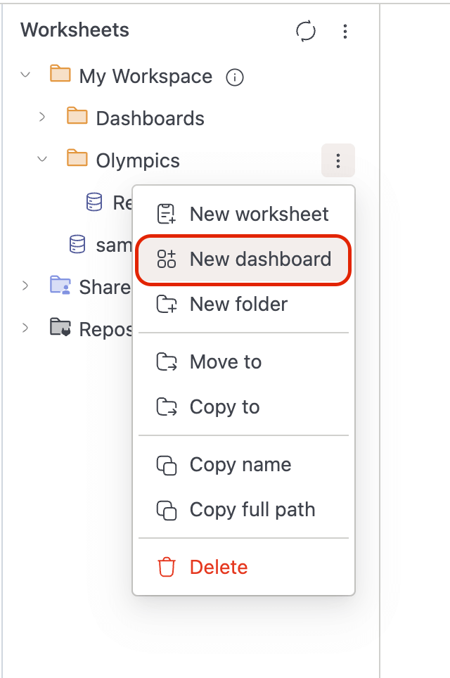
Creating Dashboards
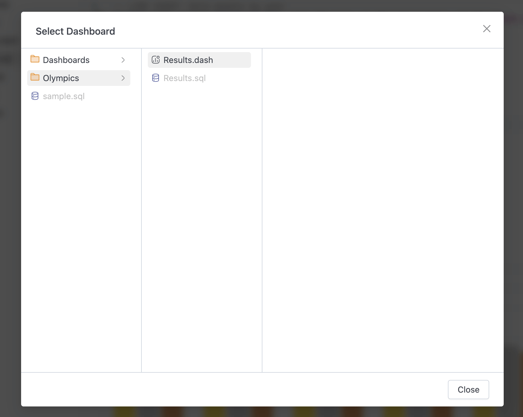
Create a new dashboard by right-clicking on any folder in the workspace sidebar and selecting New dashboard. Dashboards are organized within your workspace folder structure like other resources.
Adding Widgets
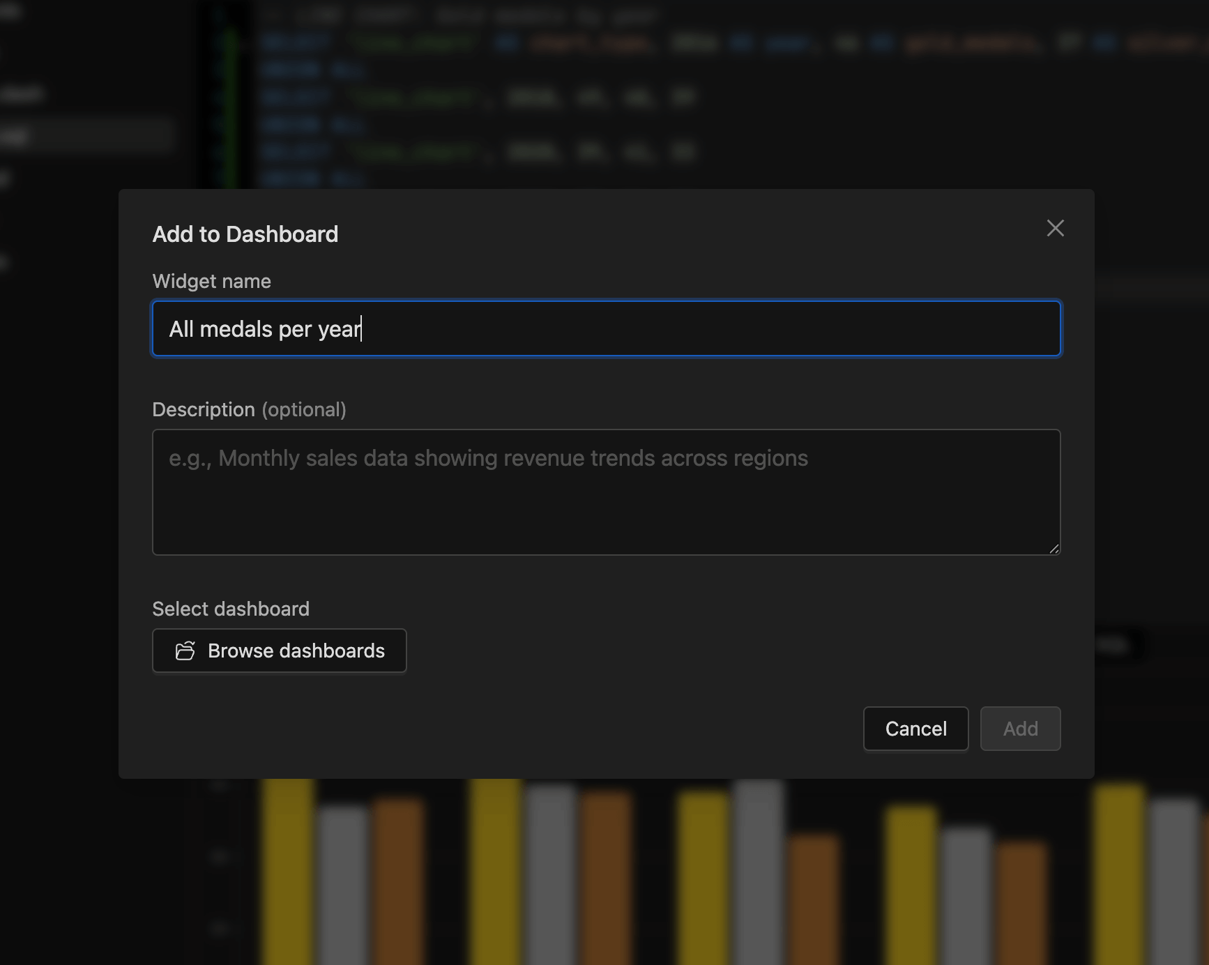
To add a chart to a dashboard:
- Run your SQL query in the SQL Editor
- Switch to the Chart view and configure your visualization
- Click the Add to dashboard button
- Select an existing dashboard or create a new one
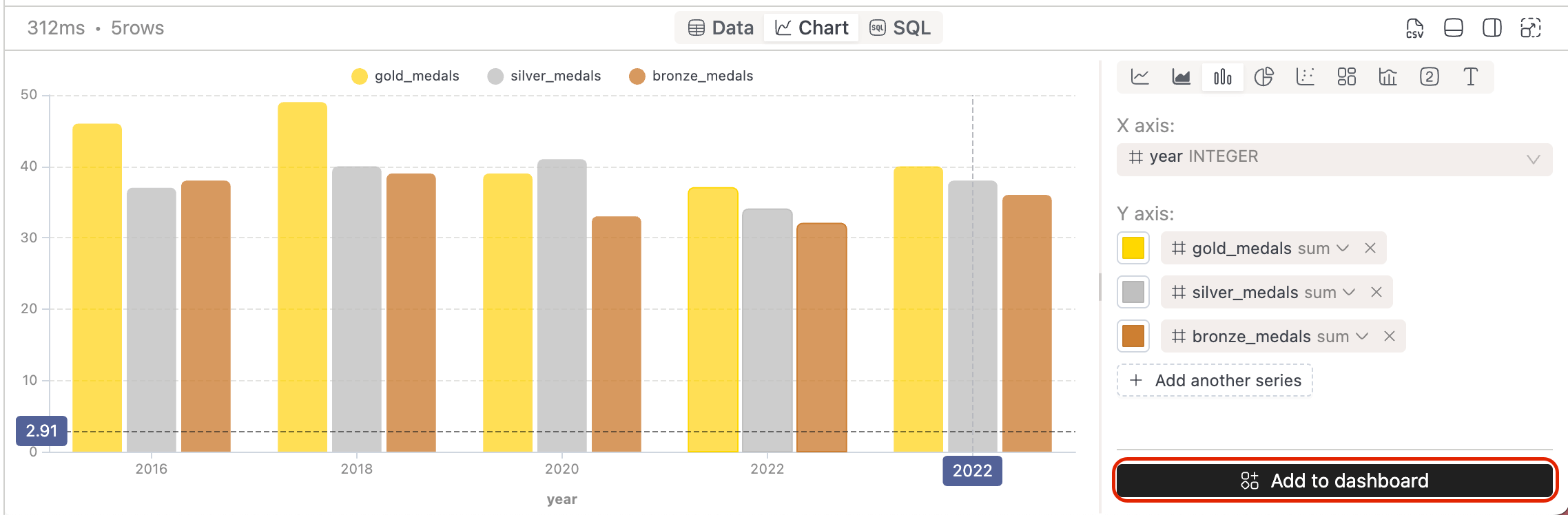
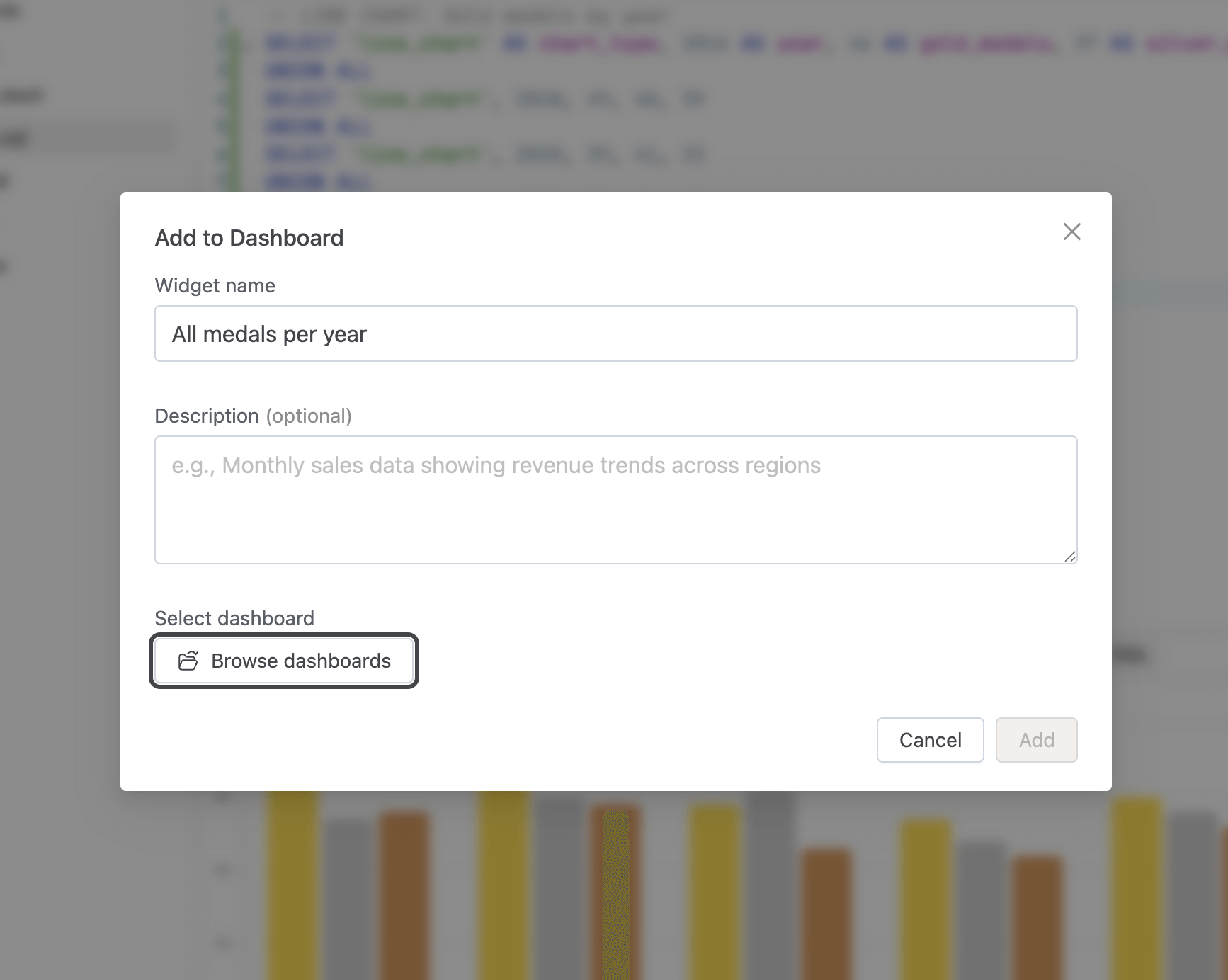
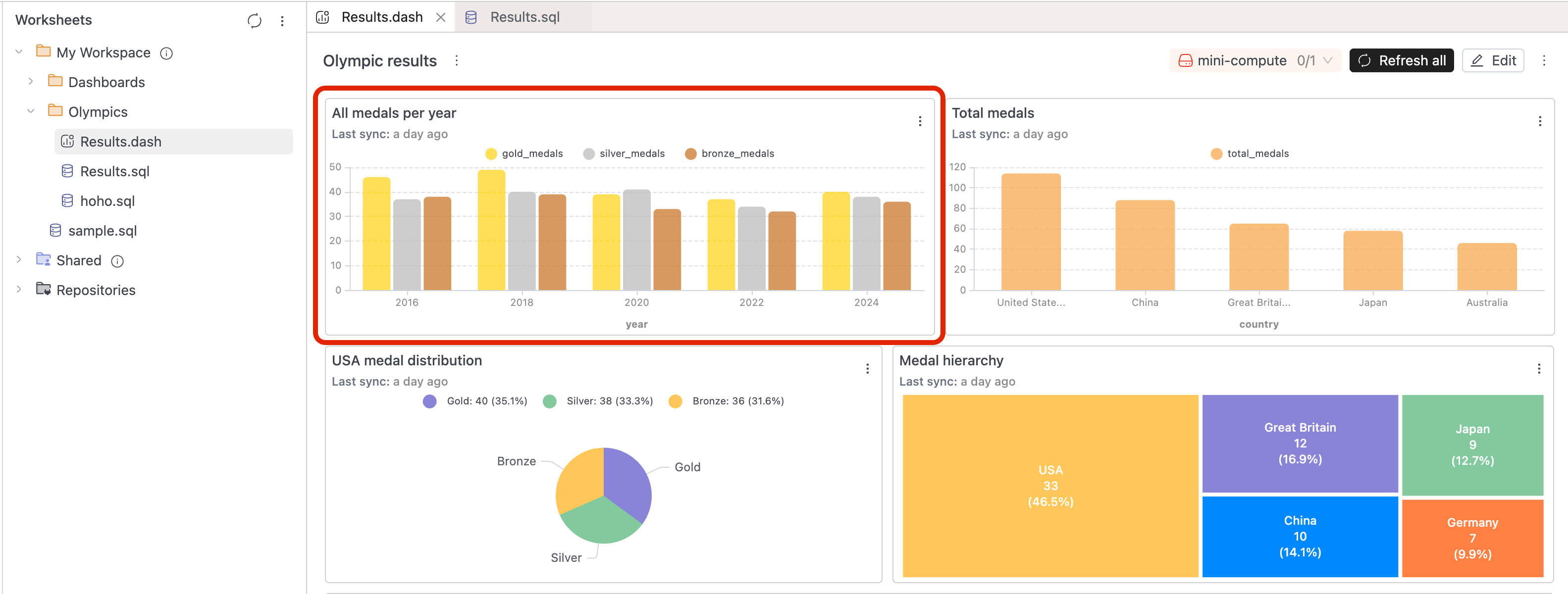
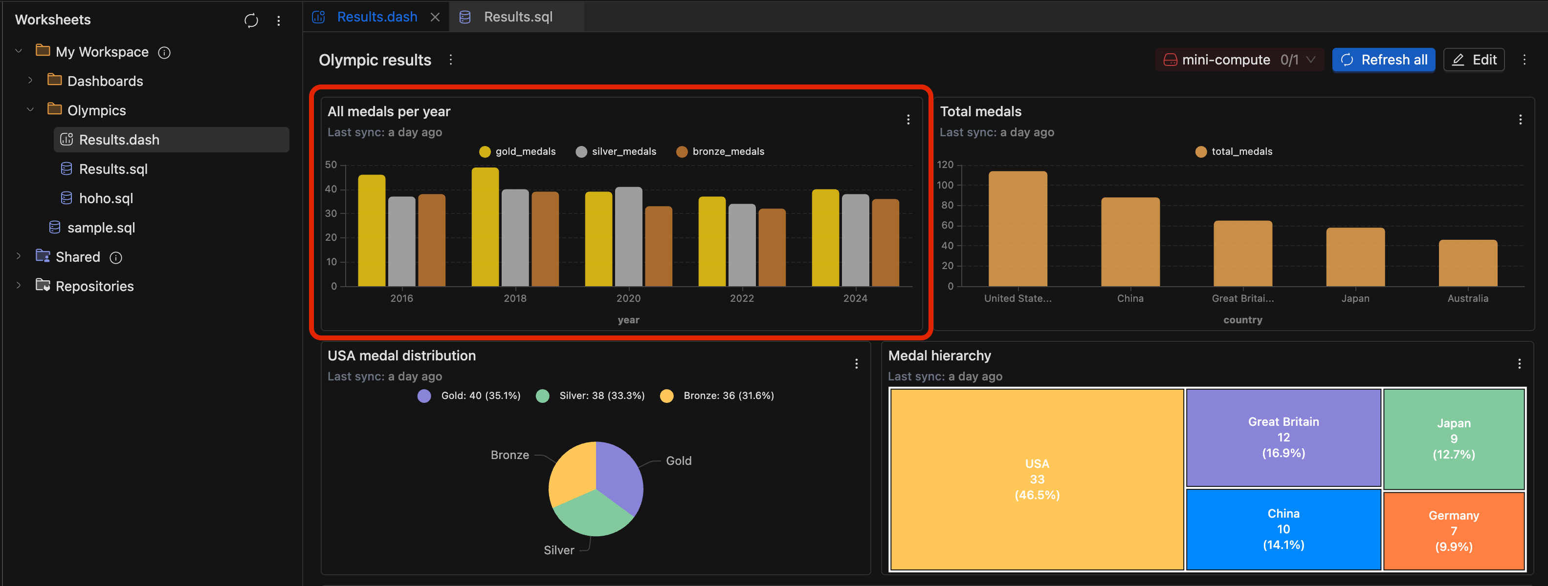
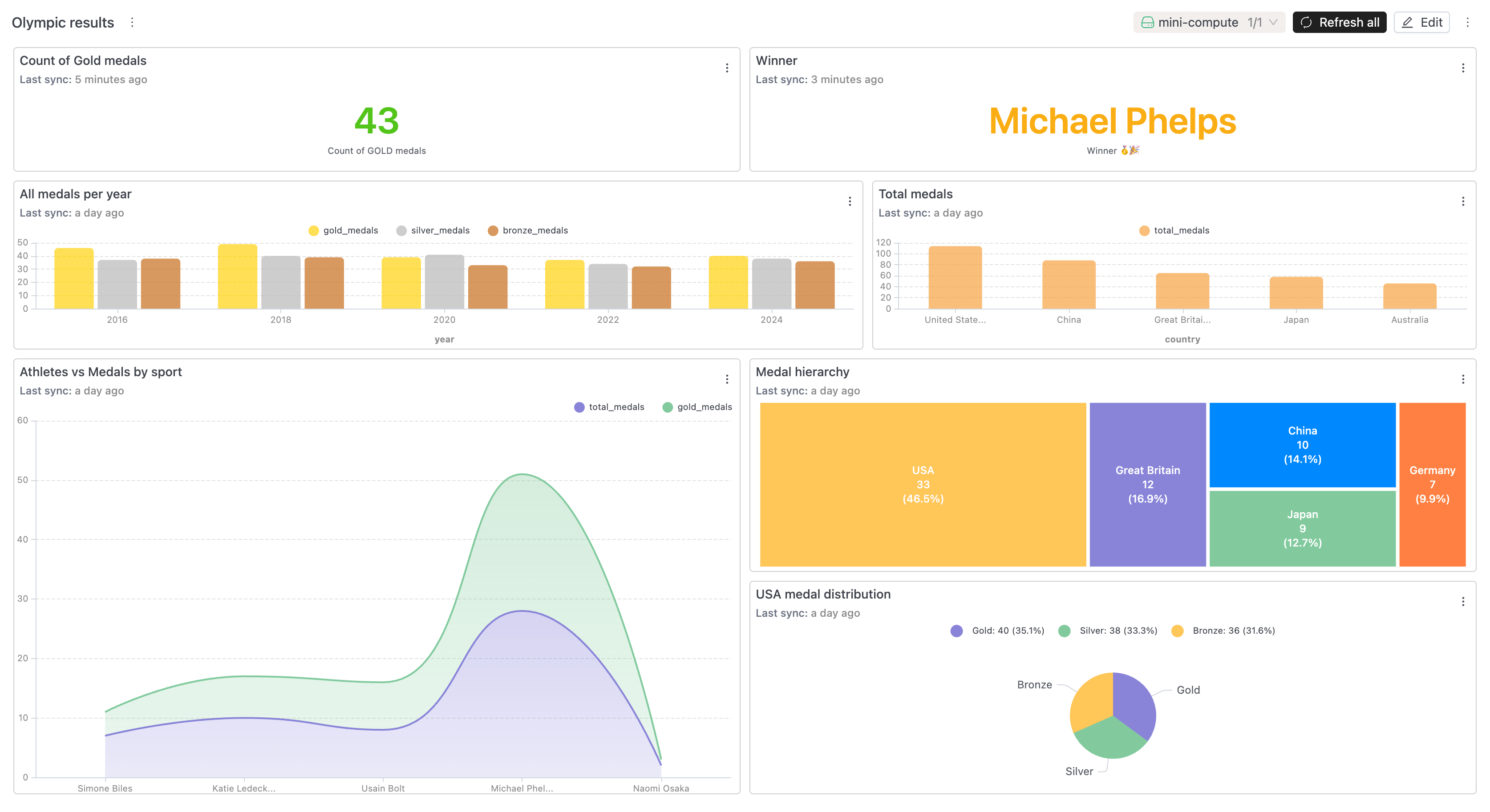
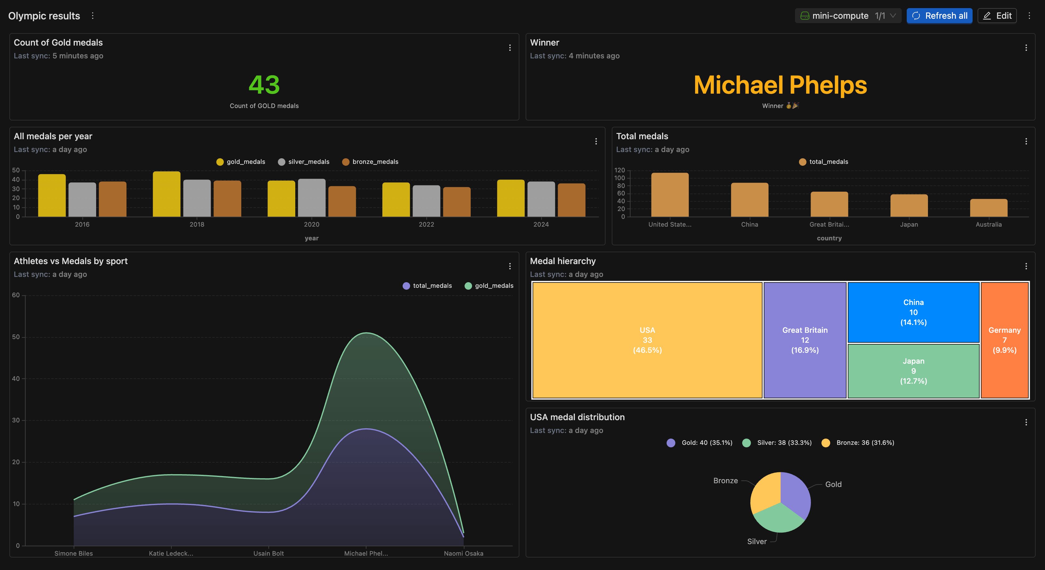
Your chart appears as a widget on the dashboard immediately.
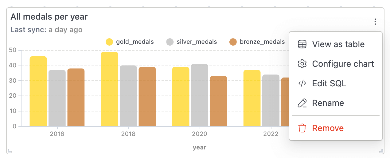
Managing Widgets
Each widget on a dashboard shows a Last sync timestamp indicating data freshness. Use the widget menu to:
- View as table – Displays the underlying chart data in a tabular (row/column) format.
- Configure chart – Opens chart settings to modify visualization options such as chart type, axes, colors, legends, and formatting.
- Edit SQL – Allows you to view and edit the SQL query that powers the widget’s data.
- Rename – Update the widget title
- Remove – Delete the widget from the dashboard
Widgets automatically refresh based on their underlying SQL queries.
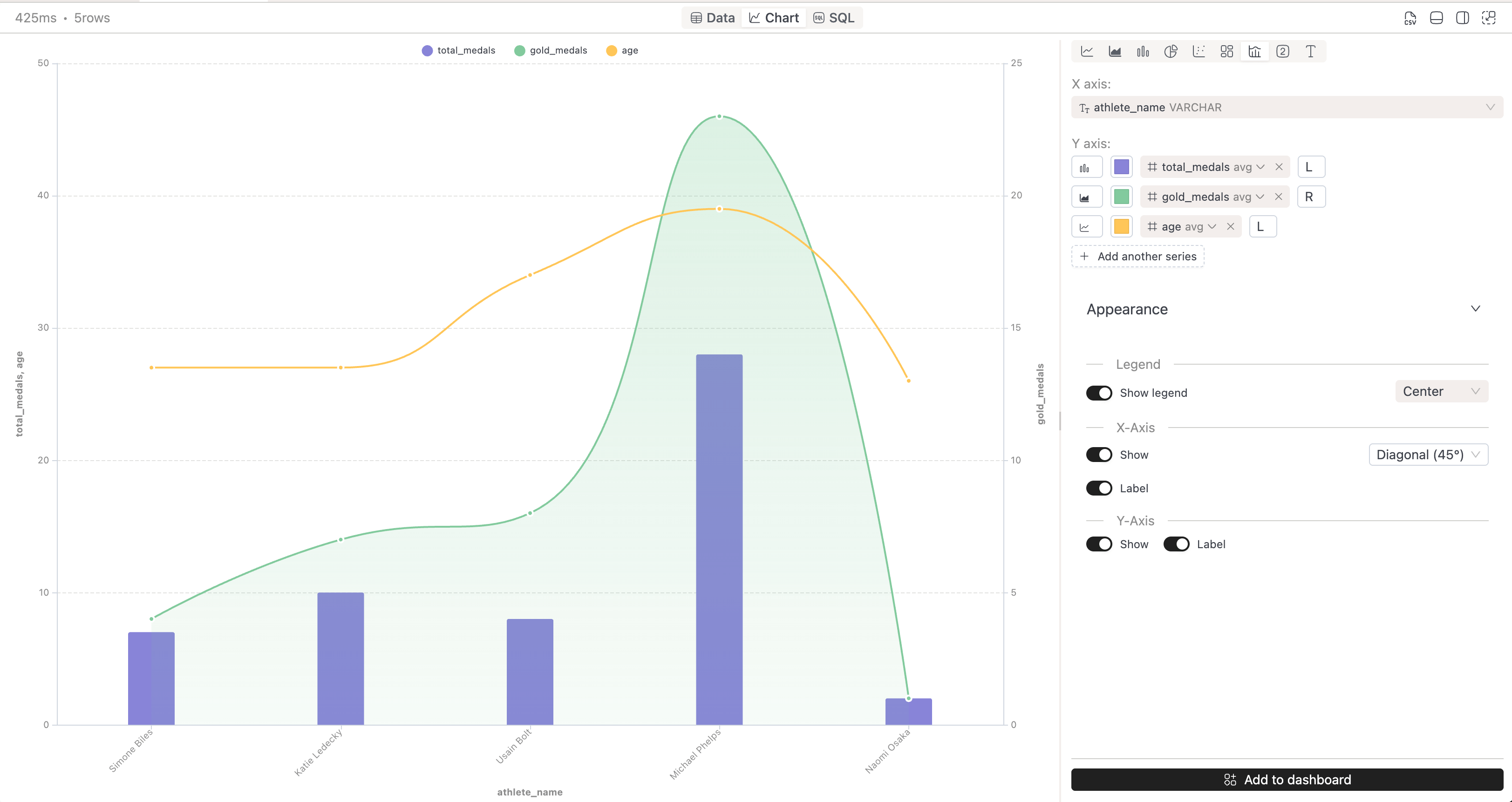
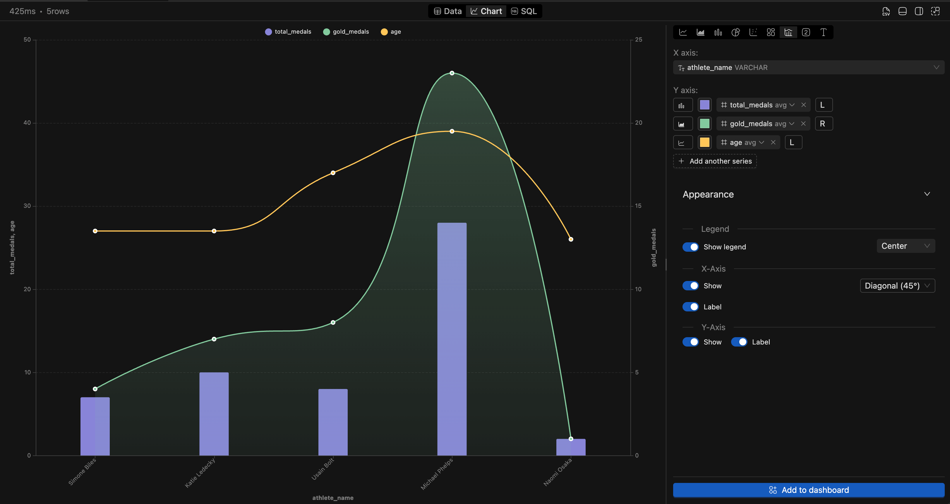
Supported Chart Types
IOMETE supports multiple visualization types for different data patterns. Common chart types include:
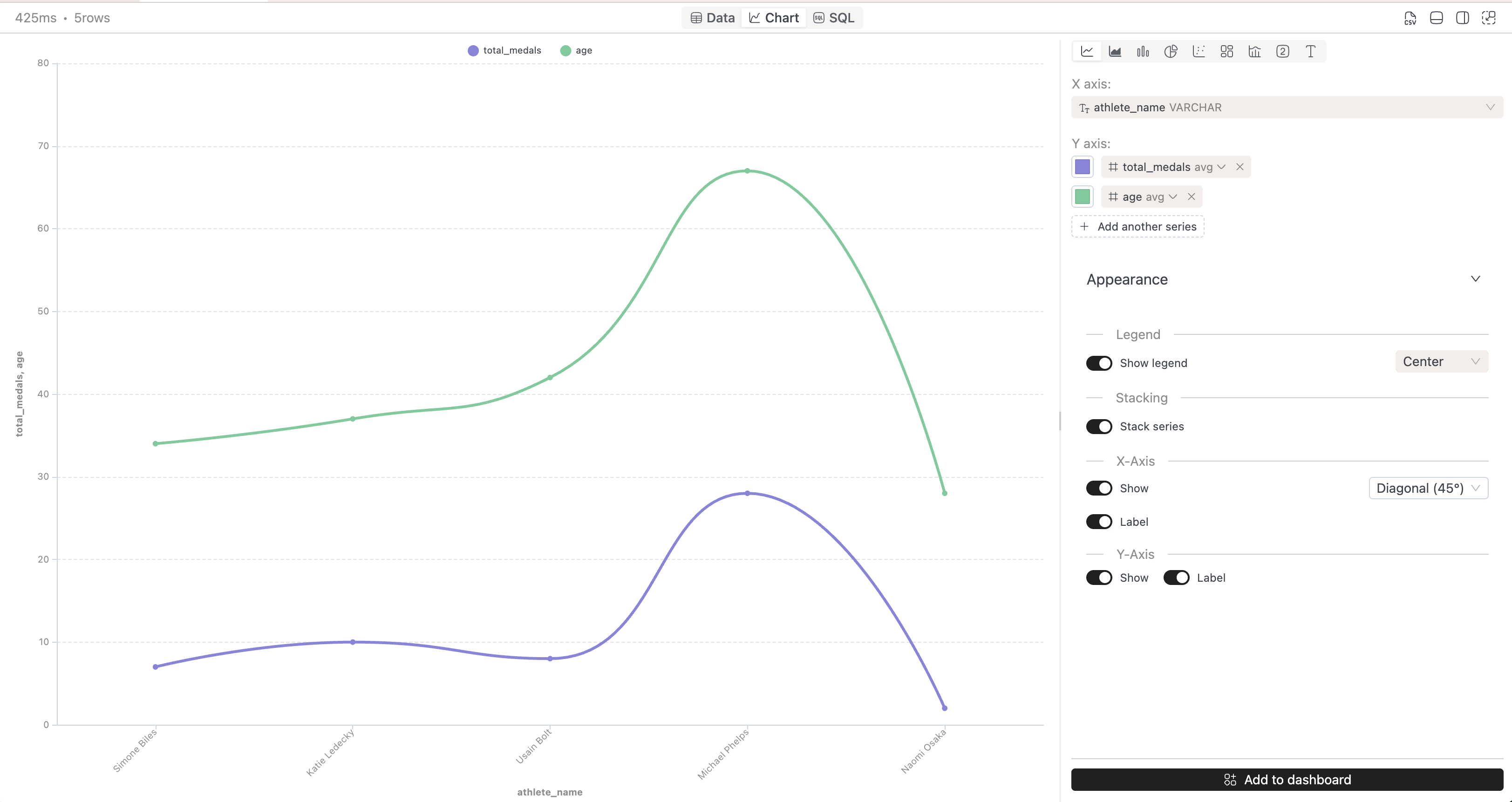
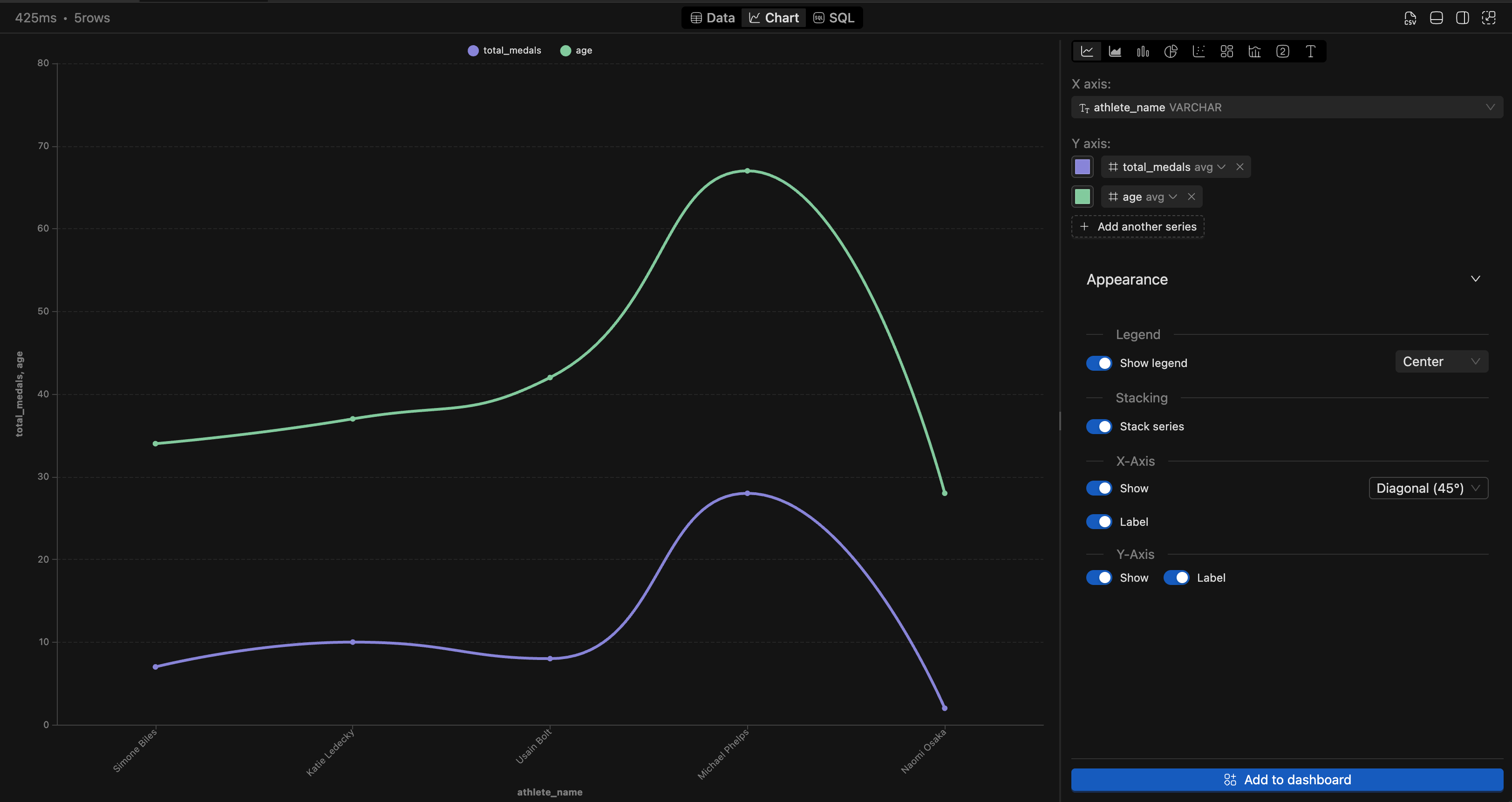
Line Chart
Ideal for showing trends over time. Configure:
- Multiple series
- Line smoothing
- Data point markers
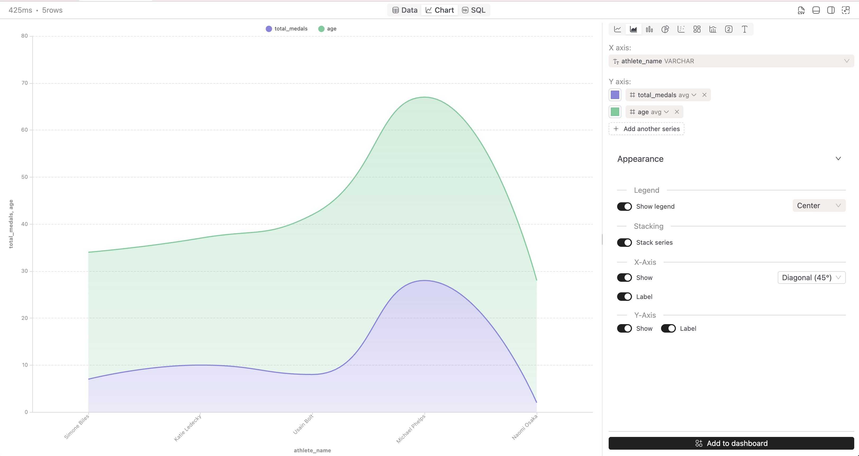
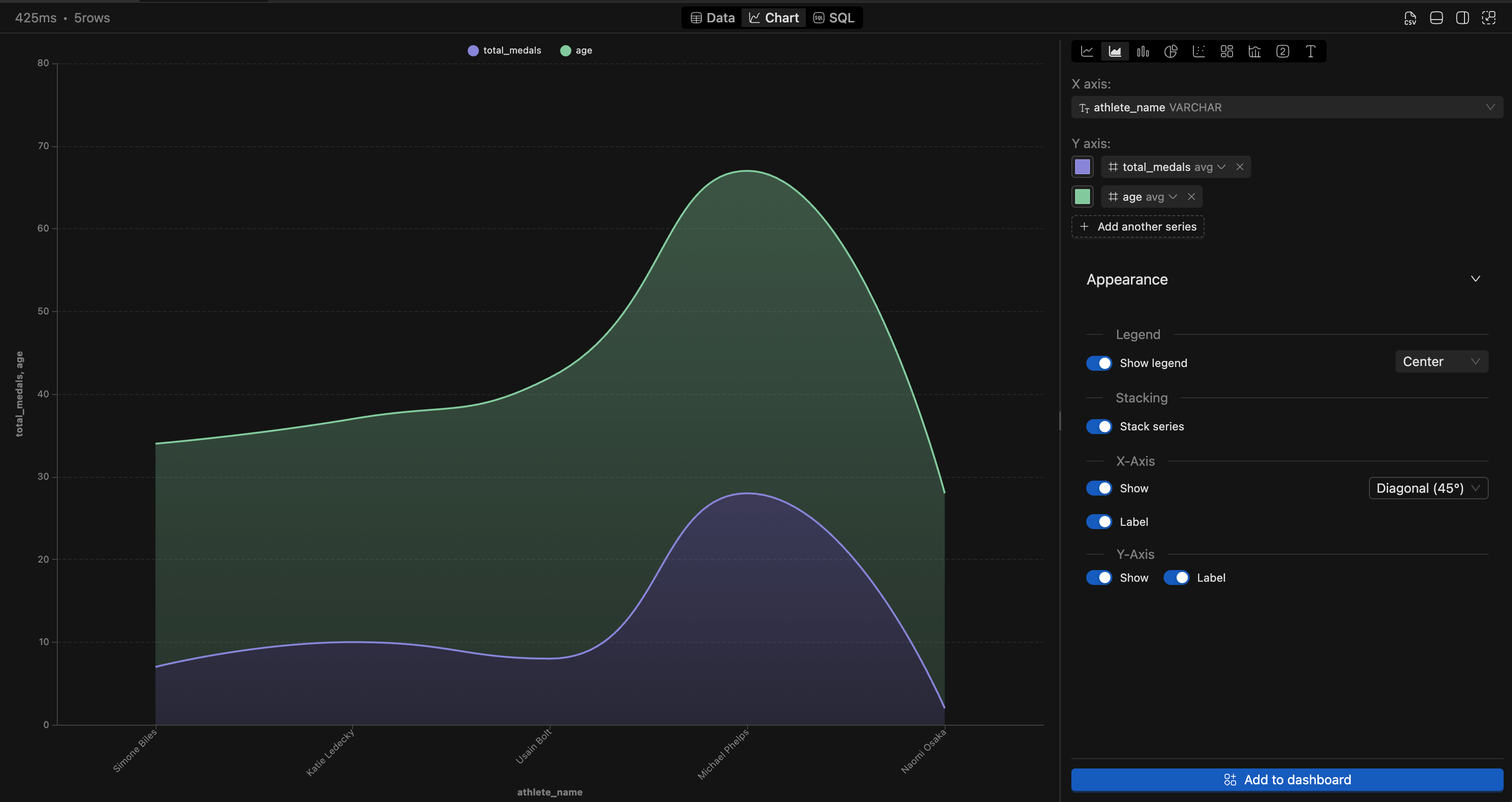
Area Chart
Similar to line charts but with filled areas below the lines. Useful for showing cumulative values or volume over time.
Bar Chart
Best for comparing values across categories. Configure:
- Horizontal or vertical orientation
- Grouped or stacked bars
- X/Y axis fields
Pie Chart
Shows proportional relationships in your data. Configure:
- Label display (percentage, value, or both)
- Legend position
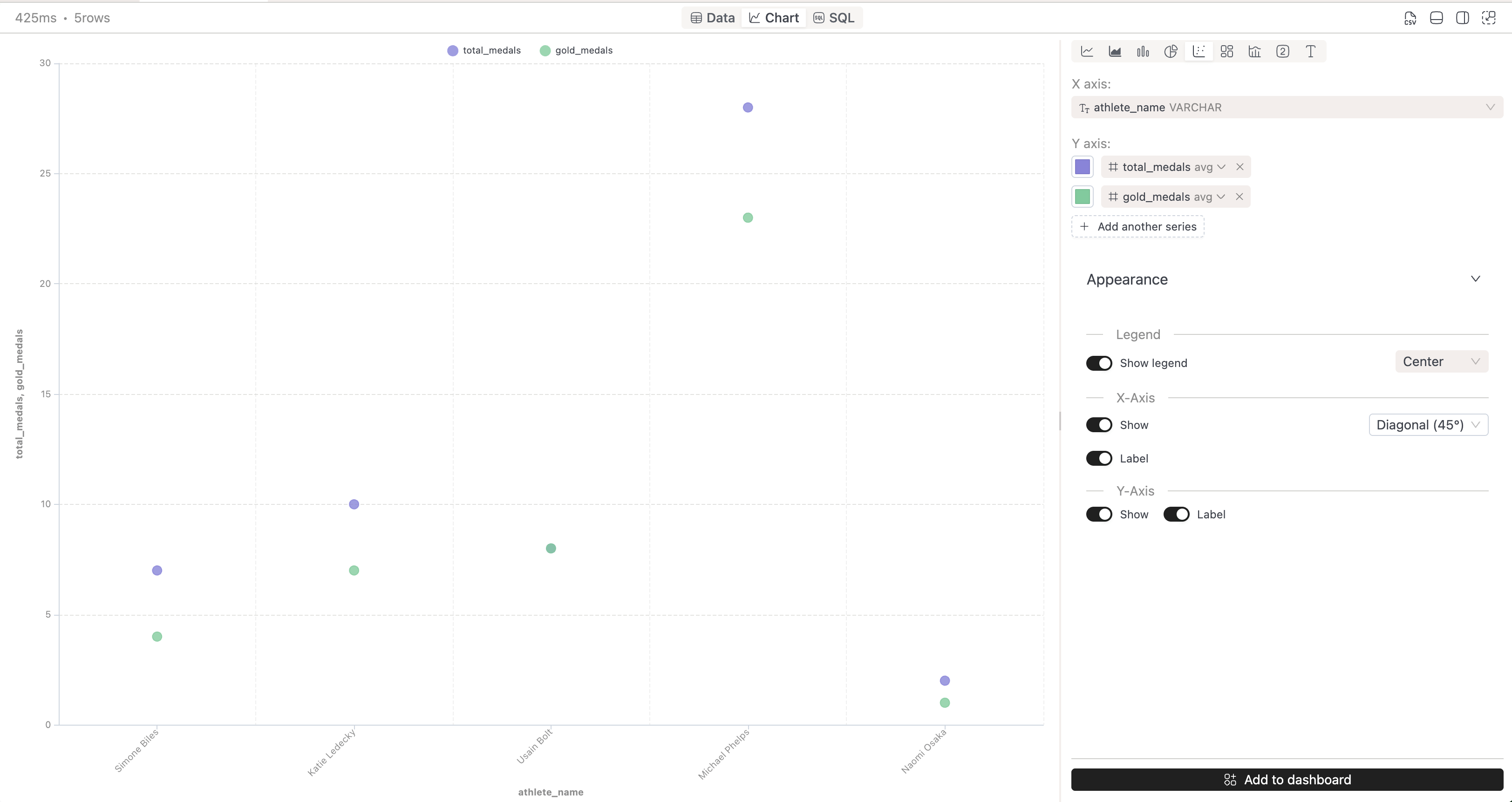
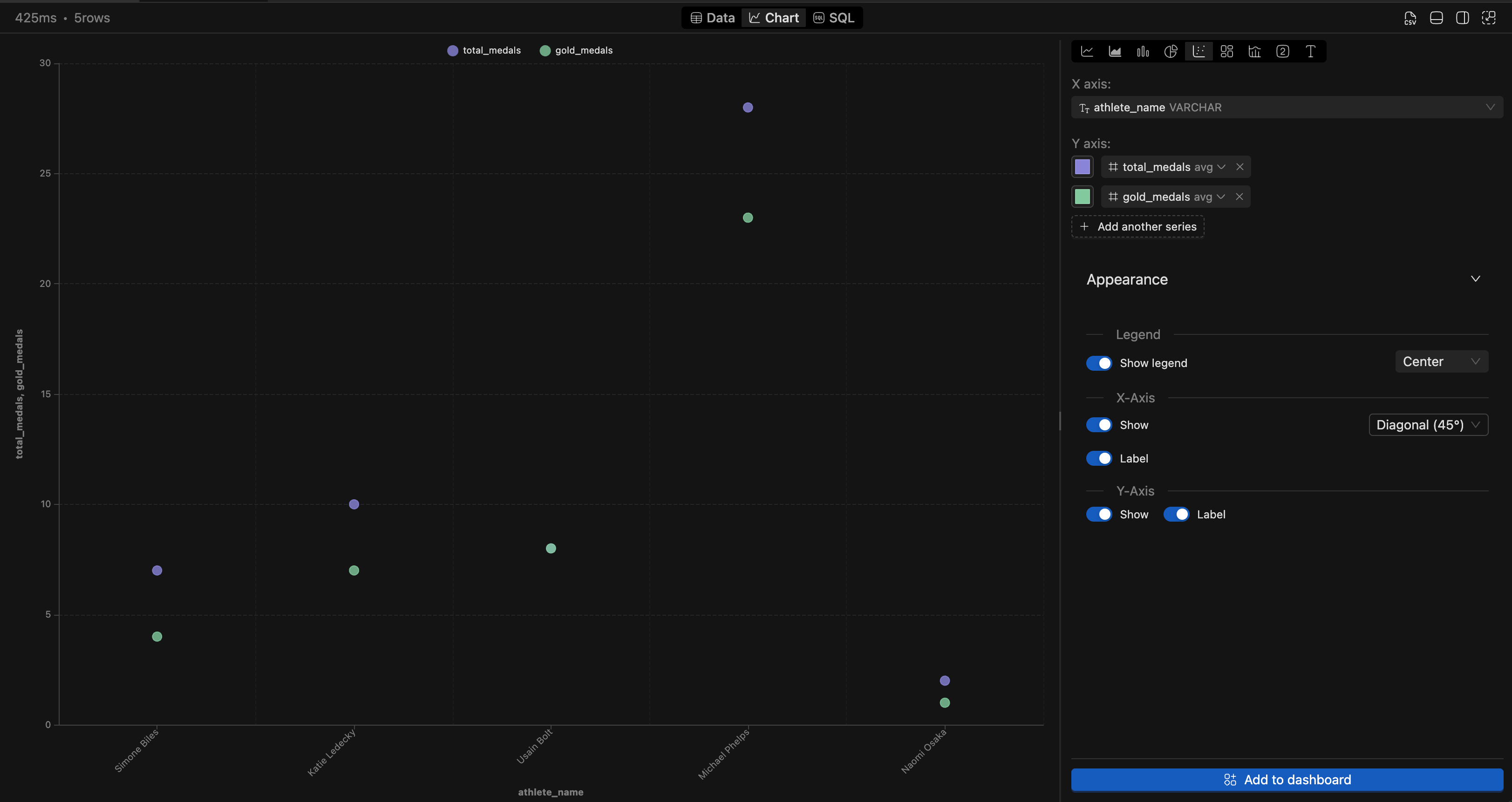
Scatter Plot
Displays relationships between two numerical variables. Configure:
- Point size and color
- Axis scales
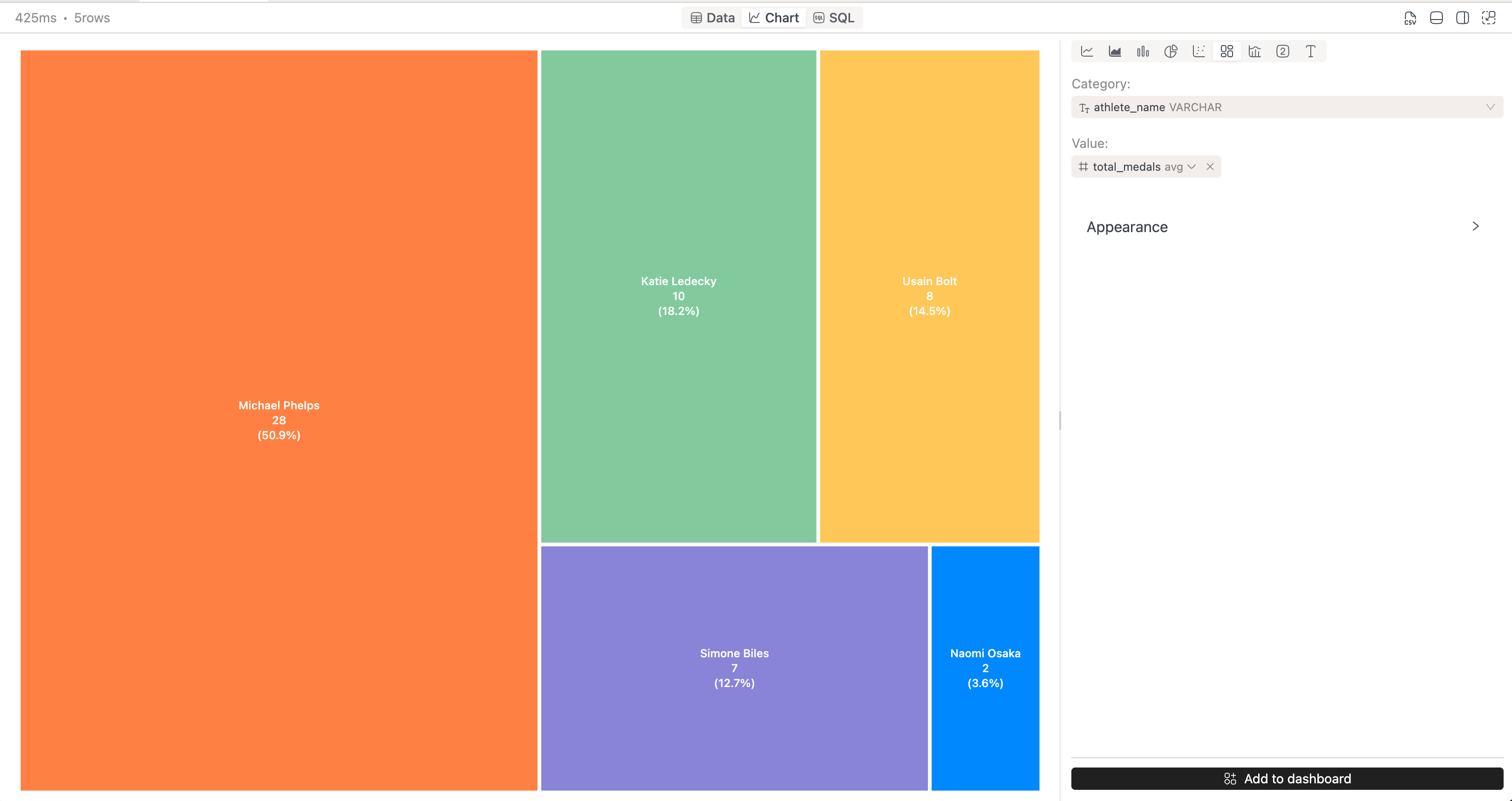
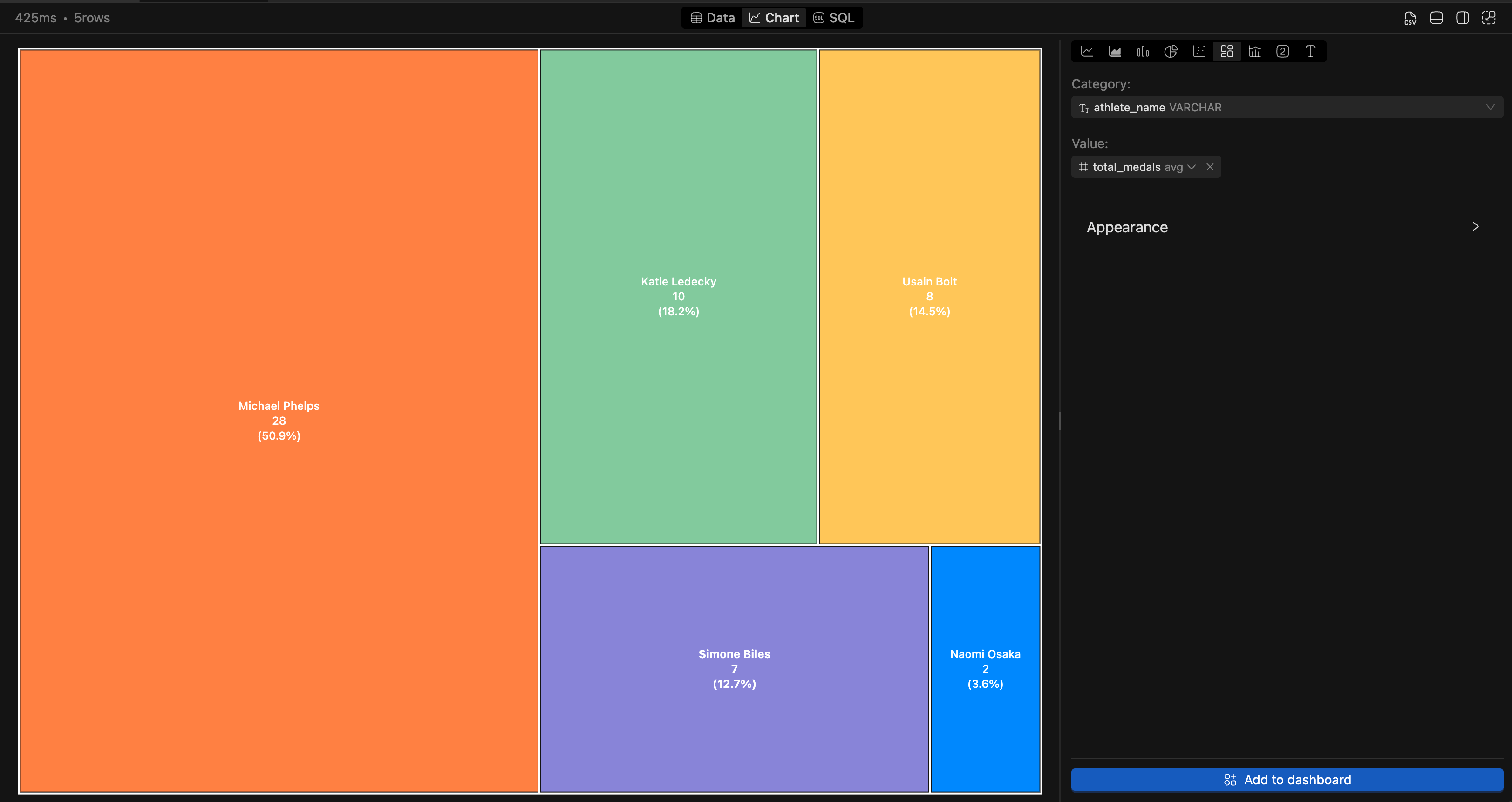
Treemap
Visualizes hierarchical data using nested rectangles. Useful for showing proportions within categories.
Combo Chart
Combines multiple chart types (e.g., bars + line) in a single visualization for comparing different metrics.
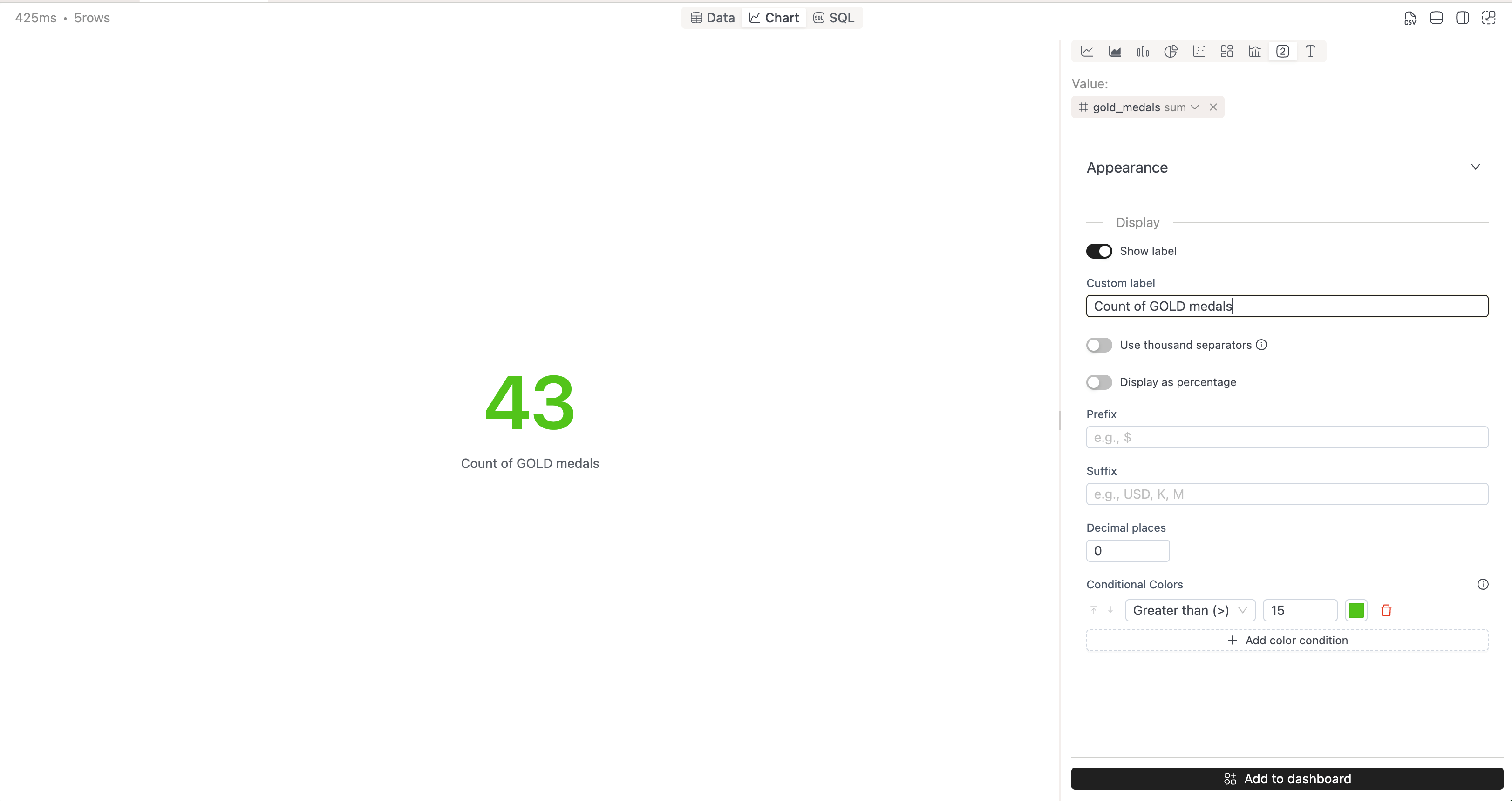
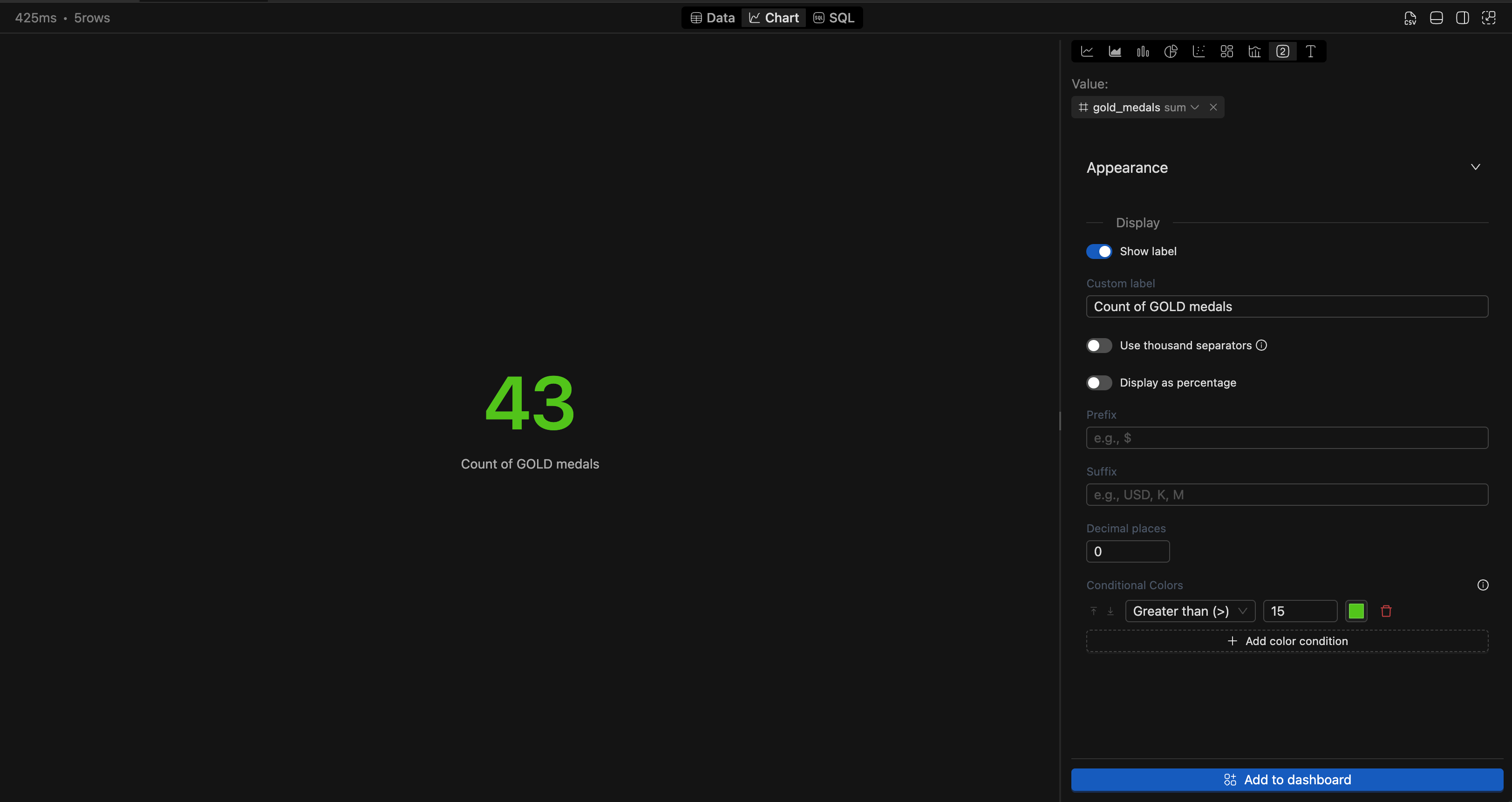
Number
Displays a single numeric value, ideal for KPIs and key metrics at a glance.
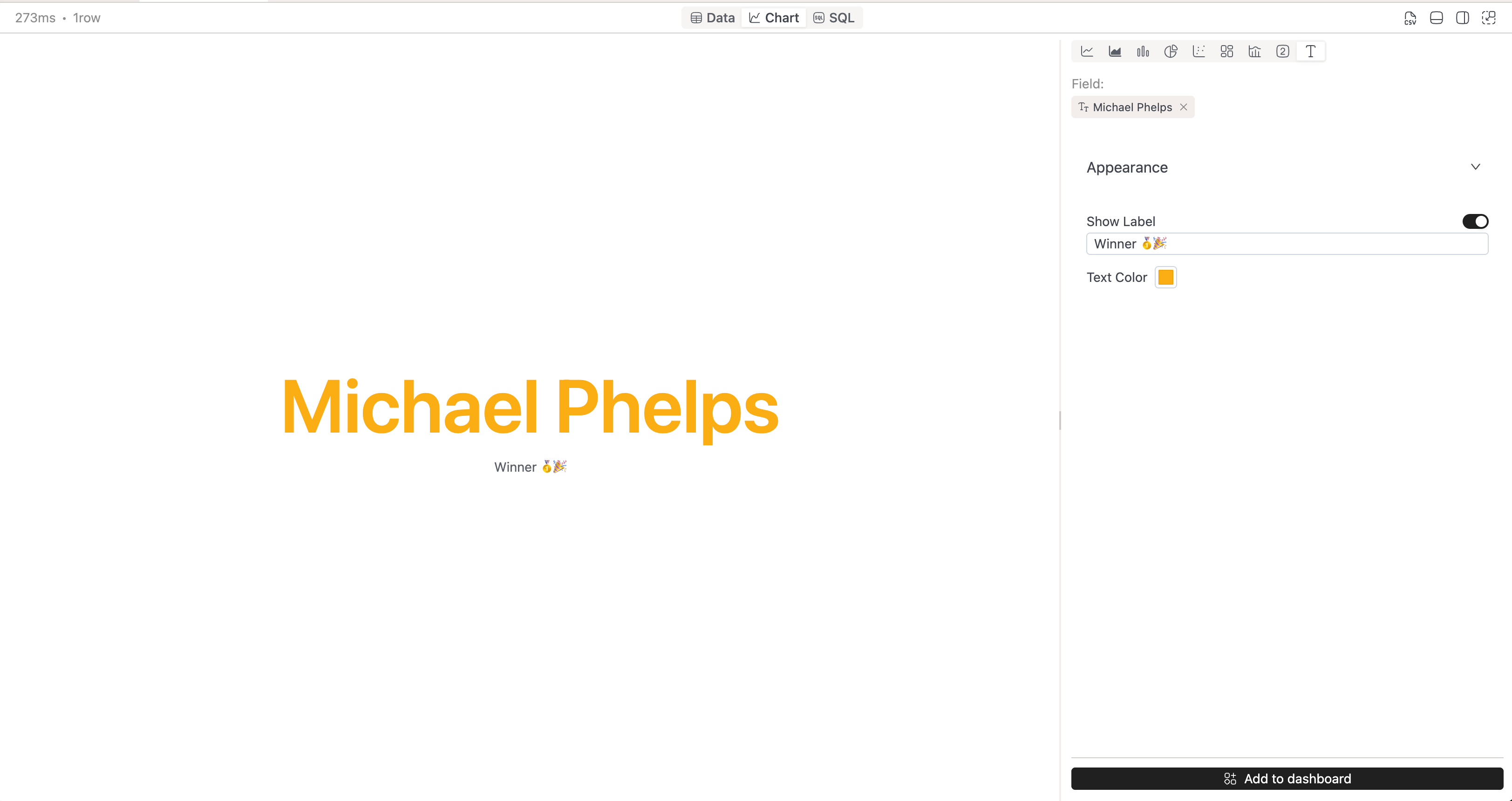
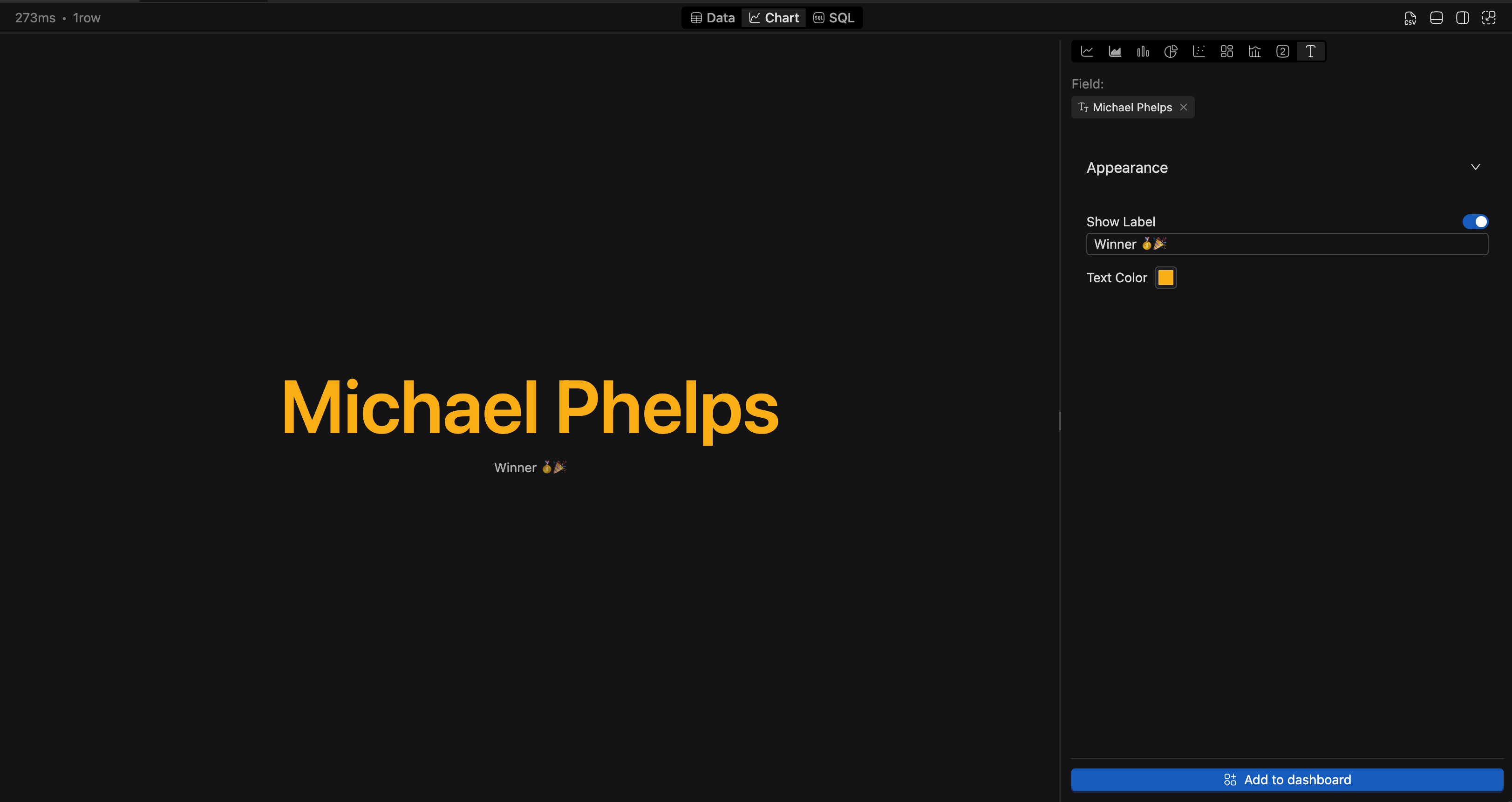
Text
Shows text values from your query results, useful for displaying labels, descriptions, or status information.
Collaboration
Sharing Dashboards
Similar to worksheet, users can share dashboards within a workspace. Dashboards follow IOMETE's standard workspace permissions model. Users with access to the workspace folder where a dashboard is stored can view it.
Dashboard queries run with the permissions of the viewing user. This means users with different access levels may see different results, and users without access to underlying datasets may not be able to view certain widgets.
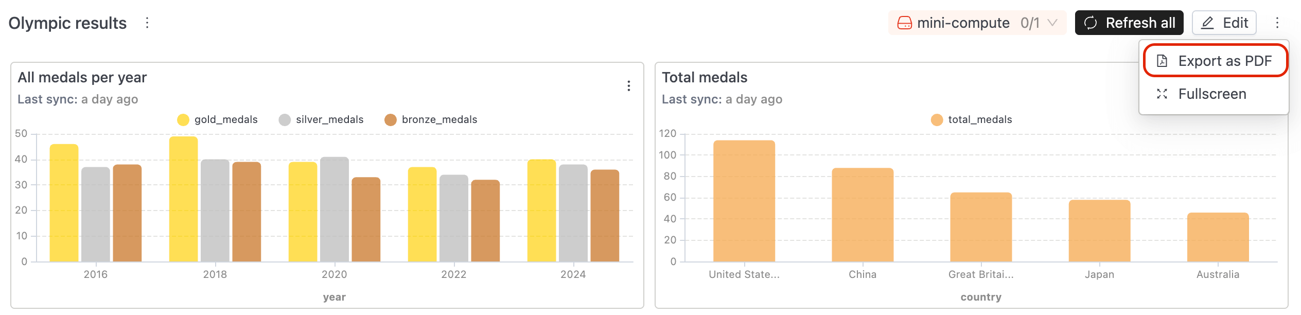
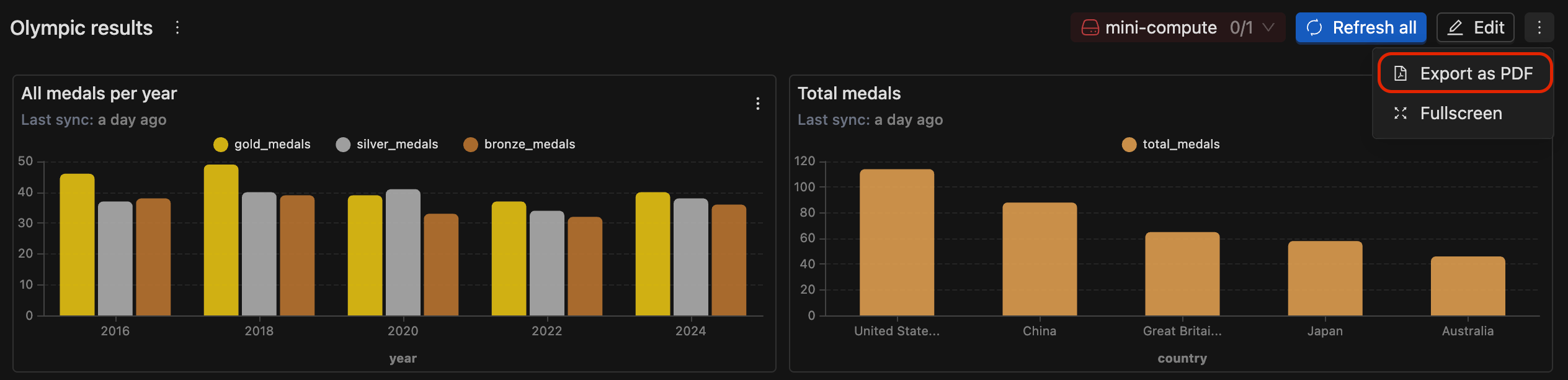
Exporting
Dashboards can be exported to PDF using the built-in export button, making it easy to share dashboard reports with stakeholders.